

piKziL


Project Details
piKziL is the musical duo of Liza Oxnard and Kip Kuepper. Long-time friends and collaborators, the two describe their music as somewhere between slanky electro-lounge and jazz nouveaux, with a little bit of scenester grit thrown in.
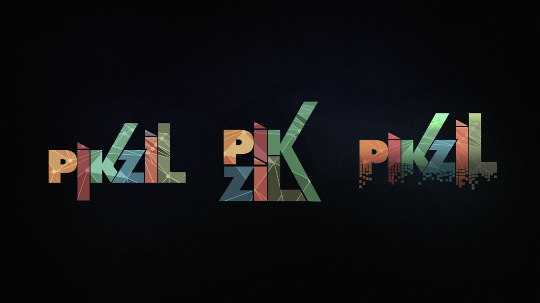
Given the pair’s unique amalgam of traditional and decidedly non-traditional music, and the emphatically electronic connotation of the group’s name, I was asked to help them create branding that would bridge the gap between the technological, and the organic.
To that aim, I selected a few typefaces that felt like a bit of a design throwback, and then heavily modified them to give them a more contemporary feel. I began with type treatments and color palettes that intimated 1980’s new wave and hair metal, and slowly moved towards a 1970’s sci-fi vibe, using colors that would fit in with my Mom’s kitchen in 1978 .
We knew that we wanted to use a pixelated, or mosaic motif to tie in with the band’s name, but I was a little concerned that might too “on-the-nose”, so I experimented with fractals, particles, and small, repetitious design elements that would imply pixelation, but not spell it out quite so obviously.
In the end, Liza and Kip chose one of my earliest submissions, and we worked on perfecting it, fleshing it out with some cool “falling” pixels, and an overlay of Buckminster Fuller-inspired geometry to give it some depth, and reinforce the retro-futurist theme.
I’m happy to report that the band loves their new logo, and has hired me to design their upcoming website as well. I’m really looking forward to continuing my relationship with them– it’s been a ton of fun!
Project Roles
Art Direction | Branding + Identity Design | 3D Rendering